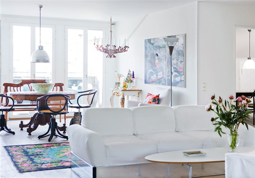
When looking for a different point of view, I often visit the websites of foreign design magazines. They are a great source of inspiration where I can get lost for hours, viewing countless images of beautiful spaces from around the world. One of the best sites is the Swedish magazine Hus & Hem. Their design aesthetic is so clean and white, which offers a nice complement to my colorful, accessory-filled home. A great example is the apartment pictured below. This space is part of a converted school building in Stockholm. I love how bright it is with quirky, unexpected touches.
I just love this table (below). It was originally a much wider piece but they cut it in half and added a marble top. Isn't that brilliant? (It reminds me of the shelves against the wall in this image).
Here is a link to the full article. Try using Google Chrome as your web browser and you will be able to easily translate the text from Swedish to English. This method is a little bit funky but you can definitely get the essence of the article and the text adds a great background to these amazing images.
*****
all photographs by Kent Bill Qvist via Hus & Hem
interior design by homeowner and designer Sigbrit Remaining Ning
interior design by homeowner and designer Sigbrit Remaining Ning


No comments:
Post a Comment