Friday, January 11, 2013

The Prettiest Mirrored Furniture


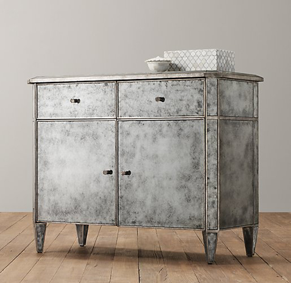
I have long been a fan of mirrored furniture (posting about it here and here), but I recently came across the Ava line of furniture from Restoration Hardware Baby & Child, and this collection really takes the cake. The lines are gorgeous and the mirror is antiqued. The effect is simply stunning.


I don't think I would hide these amazing pieces in a child's room, either! I would bring them out to be adored and celebrated elsewhere in my home. For instance, this cabinet would work really well as a console in the dining room. This dresser and side table would look great in a living room, and the nightstand would be beautiful in an entryway—a small but purposeful little table to hold your keys...and the drawers for storage are a huge bonus!

This pretty furniture certainly does give me a lot to dream about...

*****

all images via Restoration Hardware Baby and Child

Thursday, January 10, 2013

Gold Ceilings

I have a new obsession – gold ceilings.


Last week, I came across this image from Mary McDonald and fell in love. The gold wallpapered ceiling is special and adds a little shimmer without being distracting or too bold. Here it is paired with gray walls but I think it would be equally lovely in a light-filled room with soft white walls. A friend of mine is thinking about redecorating her living room and I am trying to convince her to do a gold papered ceiling in there. The room has a fireplace – imagine  how fantastic the ceiling will be with firelight dancing upon it!

Some other gold ceilings for your viewing pleasure:


It's interesting to note that all of these rooms have crown moulding. I think it's necessary when treating your ceiling in such a unique way. Notice how the color of the crown moulding, though, can affect the overall look of the gold. In Mary McDonald's room, the white crown moulding really brightens the space and makes the gold ceiling look airy. Whereas below, the black moulding makes it darker, cozy and a bit seductive.


And then there is the mid-toned moulding here. I can't tell from the photo if it is wood or gold matching the ceiling. Either way, this color brings out an earthy quality in the gold.


And finally, want just a little bling on the ceiling? This stenciled approach may be for you. I've seen it before on second floor hallway ceilings and above staircases. Very whimsical and pretty.


*****

from top
Mary McDonald's dining room reprinted in Domino Best Rooms
Carlyle Penthouse via Houzz
gold ceiling with beams via Sadie + Stella
bedroom by Catherine Badger via New Design Times
gold ceiling via homedit
gold stenciled stars via Pinterest

Wednesday, January 9, 2013

Candlestick Cluster Centerpiece

We were all set to have Thanksgiving at my Mom's this year and two days before, I decided that it would be fun to try a different kind of centerpiece on the table. I thought a cluster of glass candlesticks (set against the black, white, and gray palette of the dining room) could be really striking and different from our usual floral arrangement. My mom was totally into the idea and even ventured out the day before Thanksgiving to buy a few more glass candlesticks, because I decided this concept would only work as a big cluster. 

This was our table setting on Thanksgiving day. 


It was a big hit with our guests and I was really happy, but when looking at the photos later on, I realized how empty the table looked without flowers. I also thought this concept would look even more interesting with different styles of candlesticks. 

So, in the month leading up to Christmas, my mom and I found some really lovely options—cut glass flower petal candlesticks (they are in the front of the bottom right photo, below) and this candelabra from CB2. Hello, drama! 

We bought a bunch of white hydrangeas and on Christmas Day, we placed a single flower in each of eight tiny glasses that I scored at a local thrift store, and a bloom was placed at each place setting at the table.

Here is the result!


Our family sat around the table for hours on Christmas night—talking, laughing, and sharing stories—all with an incredible ambiance created by this cluster of candlesticks and beautiful white blooms.

*****

images by The Pink Chalkboard

Tuesday, January 8, 2013

Madeline Weinrib Ads as Art

Magazines, and sometimes the ads within them, are nice to look at, but how many times do you flip through a magazine and say to yourself, "I must hang that ad on my wall"?

As strange as it sounds, it happened to me. Three times. And here's why:


Madeline Weinrib's carpets and pillows have the most amazing patterns. As soon as I saw the pink ad, I instantly thought it would look great as the background of a photo. The little space in the middle was perfect for a small pic.


Great colors? Check. Stunning patterns? Check. Adorable little girl? Check. It's the perfect addition to my gallery wall.

Monday, January 7, 2013

Office Envy

Did you happen to catch this feature of Martha Stewart Wedding's Editorial Director Darcy Miller's home office? It is so beautifully organized and filled with such fun, colorful office supplies, that I am experiencing a serious case of office envy. Here are some of my favorite images from her work space and if you have a second, check out the entire slide show here. It is absolutely fantastic!


Jillian—maybe our future office space could look something like this? ;)

*****

images via Martha Stewart

Friday, January 4, 2013

Pantry Organization

A new year is a fresh start and for many people that often means a jump start in organization. I got inspired a little early this year and tackled my kitchen pantry back in October. I had gotten completely fed up with my messy shelves, a jumble of food and office supplies, and products falling through the wire shelving slats. Something had to be done.


Enter, the basket. I originally thought that I would just have a few baskets but they looked so clean and orderly I kept going. I bought a lot of baskets. Basically, the whole supply of all of the Target stores in a 25 mile radius. But look at my pantry now.


Early on I thought that I wouldn't need to have labels on the baskets but once I had more than 5 baskets, it really proved to be necessary. I found these Martha Stewart labels at Staples (similar labels are here). The plastic sleeve has an adhesive back and is lightly sticking to the baskets. The paper inserts are nice and big and can easily slide out to be updated down the line.


I keep my printer tucked away in the pantry so it made sense to store extra paper in there as well. Then I started gathering magazines there. Then some bills. And you know how it goes. It had turned into a messy jumble of stuff. So I got some boxes to store it all and stuck the plastic sleeves to the boxes, too, so there is some consistency in the look.


I then added one more layer of organization – a dry-erase monthly calendar (this to go along with my DIY dry-erase message board).


I'm so happy with the updated pantry. It looks good while being useful, too. Case in point – my father was over a few weeks ago and as he opened my pantry, I heard him say out loud, "I wonder if Jillian has any coffee...." And then a moment later he answered his own question, "Oh yes, she does. Here it is."

Success.

Thursday, January 3, 2013

Sneak Peek

Here is a little preview of some of the projects I've been working on. From a floral chandelier to neon painted silverware, I've been having lots of do-it-yourself fun! And I can't wait to share everything with you in 2013. 


Happy new year!

*****

images via The Pink Chalkboard
Related Posts Plugin for WordPress, Blogger...