Tuesday, January 31, 2012

A Great Idea

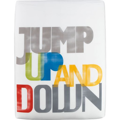
Perhaps the greatest idea for bedding ever...


What a fun way to wake up (or go to bed)! It totally reminds me Twelve Little Monkeys and I can't help but smile. 

CB2 collaborated with designer Noel Ashby to create this cheerful bedding. You can read more about the designer here on CB2's blog, in the loop.

*****

Jump Bed Linens from CB2

Monday, January 30, 2012

Wheels That Wow

Have you noticed the trend of punchy, look at me wheels?


I first noticed the yellow wheels on the CB2 coffee table (how could I not?) and since then have been spotting fun wheels all over the place!

*****

Friday, January 27, 2012

Whimsical Garland

My obsession of the moment... 


Delightful pieces of rope, cord, and trim are draped over the bed and along the wall. Simple white bed linens set off the warm, pretty color palette of the garland. That solo light bulb (love the shape!) is a great touch.

I admit that the styling is not practical, but I just love the romantic feel. So beautiful in its funky imperfection.

This photo is actually of a room at a new hotel in Amsterdam called Hotel The Exchange. A concept hotel, each room was designed by a student or graduate of the Amsterdam Fashion Institute. You can read more about this ambitious project here and see more photos here.

*****

image via trendland

Thursday, January 26, 2012

Painted Wall Mural

My good friend, graphic designer and packaging extraordinaire, Maribeth, just updated her bedroom and I'm delighted to share her photos with you.  Inspired by this West Elm bedding,


Maribeth painted a mural behind her bed.  Here's what she had to say about it:
It is a small but long room, so I wanted a visual element at the far end behind the bed to create a strong focal point and some drama. I was also having difficulty figuring out a way to create some balance due to the asymmetrically placed glass inset at the top.  I couldn't figure out any kind of wall hanging that would do the trick.  So, an all over wall mural seemed like a good solution.

We have featured some of Maribeth's design work here before (many of her works were honored at the Philadelphia Design Awards) and are happy to get a glimpse now into her home.

Well done, Maribeth.  Thanks for sharing!

*****

bottom photos by Steven Kradel

Wednesday, January 25, 2012

China Mashup

Seletti has done it again! 

I had posted here back in August about Seletti's use of colorful polka dot and stripe patterns on traditional furniture styles. The result was really incredible. And now, they have teamed up with CTRLZAK Art & Design Studio for another amazing project. This time they have reinvented conventional china patterns. 

East meets West in the aptly named Hybrid collection. Designers have literally paired Eastern and Western patterns on the same piece and the outcome is sensational. Just take a look...


Hello drama! These place settings are full of spirit. Can you imagine a long dining table filled with these pieces? So eclectic and so cool. 

Seletti and CTRLZAK have really taken the concept of mismatched china (a favorite of mine) to a whole new level. 

*****

all images via Seletti

Tuesday, January 24, 2012

Alice Supply Co.

Fun, colorful, cheery and occasionally preppy -- I never thought I would use those words to describe cleaning products, but it's true!  Check out these household items by Alice Supply Co.

A pretty plunger or designer dust pan, anyone?

*****

all products from Alice Supply Co.
2. dustpan
3. hammer
6. plunger
7. toolbox

Monday, January 23, 2012

The Age of Aquarius

For all of you water babies out there, I have some astrology-inspired design goodness for you. January and February can be pretty bleak, so luckily we have these poppy, swirly designs from Oh Joy!, Jonathan Adler, and others to cheer us up. Happy Birthday Aquarians!


*****

images from top to bottom:
Lovely Aquarius Birthday Greeting Card by Oh Joy! for Tiny Prints
Zodiac Mug from West Elm
Aquarius Zodiac Needlepoint Pillow from Jonathan Adler
Aquarius Porcelain Mug from French Bull
Aquarius Key Fob from Jonathan Adler

Friday, January 20, 2012

Coni Della Vedova

We were recently introduced to the work of graphic designer, Coni Della Vedova. Her etsy shop, coniLab, is filled with lots of charming typographic designs that are all handmade screen prints. 

Take a look at Jillian's favorites...


(How sweet is that toothbrush graphic?)

And here are Mindy's favorites...


And finally, a little inspiration for all of us to end the week...


Happy Friday!

*****

all images via coniLab

Thursday, January 19, 2012

Inspired by Franz Kline

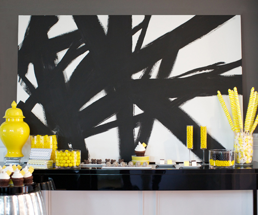
A few weeks ago, we mentioned the fabulous photo shoot we styled with Channa.  Now it's time to show some more pics from that shoot.  Here are some shots of the dessert table.


The dark chocolates and bold yellow candies are certainly delectable-looking on their own, but we wanted to make a bolder statement to the overall tablescape so we placed a graphic painting of mine behind it.  A statement piece like this is certainly easy to create yourself.

Inspired by Franz Kline's work, I decided to try my hand at making something similar to it.  Here are some of his works that I looked to for inspiration:

Untitled

Painting

Hazleton

In my last apartment, I needed a headboard but I wasn't willing to spend a lot of money for it (sleeping with my head right up against the brick wall just wasn't comfy). So I purchased a large white stretched canvas from Dick Blick and added some subtle detail with brown tape.  It was temporary, simple and matched my duvet. Nothing fancy, but it worked.


I wanted to reuse that canvas for my painting.  I had some white primer left over from a dresser I painted so I put that down first so the background would be a clean, bright white.  Then I just had fun with black acrylic paint and some large paintbrushes.  A brush stroke here, a brush stroke there, and 20 minutes later it was done.


So simple, yet energetic and fun.  A statement piece for the living room, dining room, bedroom...
or even as the backdrop for a festive dessert table!

*****


photography by Sarah DiCicco
paper products by Lily My Love
styling by Lily My Love and The Pink Chalkboard
image of canvas headboard by The Pink Chalkboard

Wednesday, January 18, 2012

Rodney White

Check out the texture in artist Rodney White's paintings. His work is so graphic, raw, and distressed. It's such a contrast to the optimistic messages in his pieces, especially in these examples below.

Possibilities--Imagine Yourself

#2 (So Be It)

Drink

Doesn't this image above remind you of old Coke ads?  Inspired by vintage advertisements, Mr. White says this about his work:
When I was a student of visual communications, I began to see the power that commercial advertising messages could wield. Instead of selling products, I decided to use the medium to offer a more beneficial gift to the viewers, themselves.
Perfection Leaves

"B"

This one feels perfect for all of us DIYers out there!

Aren't You Crafty

*****

first five images via Artaissance
last image via rodneywhite.com/shop

Tuesday, January 17, 2012

Sacha Mirror


Like a big piece of jewelry for your wall (especially when clustered together), this mirror is all sorts of sparkly fun.

*****

Sacha Mirror from Ballard Designs
4 shown above

Monday, January 16, 2012

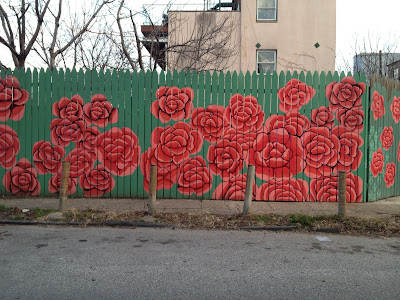
Urban Blooms

Who says flowers only bloom in the spring and summer? Take a look at these beauties that we are lucky enough to enjoy all year long.


Spotted on a recent walk through my neighborhood (Northern Liberties, Philadelphia), these delightful murals sure brighten otherwise neglected properties and remind us that we really can find art in the most unlikely places.

Want to see more street art? Jillian posted here about great art that she spotted in New York this summer. 

*****

all images by The Pink Chalkboard

Friday, January 13, 2012

Kate Bingaman Burt

I recently came across Kate Bingaman Burt's etsy shop and instantly fell for her sweet little illustrations documenting consumption.  A bunch of cassette tapes have never been so charming!


Or if memories of mixed tapes from the 80's aren't your thing. How about something for your kitchen, craft room, or sun room?


*****

images via kateconsumption on Etsyfrom top to bottom

Thursday, January 12, 2012

Half-Painted

Over the past year I've been noticing a design trend in which furniture and home accessories look like they are, well...half-painted.

I first spotted this idea on Urban Outfitter's website. They often feature their bedding with a half-painted iron headboard, like this:


So charming and just different enough to make you pause and take notice.

And then I started seeing other pieces, like this table from West Elm...


or this whimsical alternative from Curtis Popp...


and even these chairs.


This trend doesn't seem to be stopping at furniture, either. Check out these baskets:


While the basket in the image above is made out of different materials, I think it follows the same idea.

Even tabletop items are looking half-painted. Take a look at this cup and saucer set with the fun handle. Isn't this pop of color fun?


And because I love all things silverware (featured here and here), I thought it would be perfect to finish my little collection with this half-painted serving set. A playful take on a traditional design.


I really hope we see more of this half-painted trend in 2012. I think it's a great way of showing the beauty in something that is unfinished. 

*****

images from top to bottom via Urban OutfittersWest ElmCPopp WorkshopWharfsideMartha StewartAreaware, and the MoMA store
Related Posts Plugin for WordPress, Blogger...