Wednesday, August 31, 2011

Sitting on Sunshine

After the crazy/rainy/stormy hurricane weather we've been having, I'm thinking of the color yellow and longing for a piece of permanent sunshine in my house.

Yellow chairs are just so happy.  The chairs below are super simple, but when you have such a strong burst of color, lots of details and frills just aren't necessary.

fleet chartreuse chair

french bistro style chair

wrap bar stool

Note the cute little yellow balls on the bottom of this stackable chair.

stack chair

Then there is this upholstered chair.  The yellow color is slightly muted and the pattern is lovely.  It would look so nice in my bedroom.

chloe chair

And this chair is a favorite of mine -- more in concept than anything else, though.  I think the painted yellow frame is really clever.  It makes the chair look so fresh.  

carly chair

A few months back, I painted my great Aunt's desk chair gray and am currently working on reupholstering the seat (I'll post about that soon).  I always thought that a way to modernize old furniture was to paint it in a neutral color like white, black or gray, but this yellow frame is so refreshing that I'm itching to try something like this in my own home.  Just need to find the perfect piece to do it to.  I have officially added it to my mental to-do list that keeps growing longer each week. 

Here's hoping you have some warm, yellow sunshine in your day.

Tuesday, August 30, 2011

A Touch of Tiffany

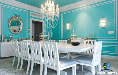
This summer, the St. Regis New York debuted its redesigned Tiffany Suite and oh my, it is magnificent! Every detail--from the luxe fabrics to the Tiffany accessories, the lighting to color choices (Tiffany blue and dove grey), the finishes to sparkling mirrors, even the crown molding--represents Tiffany perfection.

entryway image courtesy of the St. Regis New York via designwire daily

I love the image below of the master bedroom because it feels so opulent and refined. I like that there is just a hint of Tiffany blue on the headboard. My favorite features here are the porcelain flower sculptures along the wall above the bed.

image by Cynthia Drescher via HotelChatter

Below is the dining room which looks like the inside of a Tiffany jewel box. I love the signature Tiffany blue on the walls--and ceiling! Doesn't the chandelier look like it is dripping in pearls and diamonds?

image by Cynthia Drescher via HotelChatter

Breakfast at Tiffany's indeed!

You can read more about the new Tiffany suite in the September issue of Travel + Leisure magazine featuring beautiful photographs by Buff Strickland. You can book this $8,500/night suite by clicking here for the St. Regis New York website.

Saturday, August 27, 2011

Rain, rain, go away...

image via noodle 'n thread

Hurricane Irene is heading up the East Coast now and it's supposed to be stormy and rainy all weekend here in Philadelphia.

We think this greeting card from Seattle-based noodle 'n thread feels so perfect for moments like this.

The umbrella design here is actually hand cut with a layer of chiffon applied underneath. So thoughtfully created and special. You can see more of their incredible work here at Felt & Wire Shop.

We hope that everyone stays safe and dry this weekend and we'll catch up with you after the storm!

Friday, August 26, 2011

A different kind of pet

While walking in Philadelphia the other day, I passed by the fabulous Jonathan Adler store.  It was after hours so the store was closed, but I spent some time peeking in the window and was taken with this clever quote on a store display:

Allergic to fur? Get a ceramic pet.

While I had seen some of Jonathan Adler's ceramic animals in the past, like this giraffe lamp that has appeared in countless adorable nurseries,


I hadn't realized just how large his menagerie had become.

rhino box

doggie


gorilla

baboon

elephant bank

Fun and graphic, these are perfect for adding a touch of whimsy to a space.  So many great animals to choose from but the rhino is hands down my favorite.  What's yours?

Thursday, August 25, 2011

Ahhhh.

A few weeks ago I spotted this clever billboard.


It was an incredibly hot day and as I stood outside waiting for the train, this one word in such cool colors and modern typeface grabbed my attention immediately. And that period at the end? A logo! I loved it. 

It turns out that the billboard is just one in a series of posters that are part of a greater Regional Rail Campaign for EnergyWorks. Developed by the Mayor's Office of Sustainability with creative done by Neiman Group, each poster features fresh typography (my favorite!) in the same cool color palette.


Each poster is finished off with that lovely logo design which you can see close up here. 


I think this logo design evokes lots of movement and energy, which is perfect for a non-profit organization aptly named EnergyWorks.  

Consider some of the other components of this campaign. The ads below actually ran the length of SEPTA train car ceilings. Smart. Just looking at them makes me feel calm and cool...


And maybe even a little bit cozy...


Then there are these inventive ads that use short, sweet prose to immediately transport your mind to enjoying comfortable moments at home.


Did you happen to catch that tagline? When your house is more comfortable, you're home. Brilliant! This campaign really captured my imagination and I can't wait to see what they come up with for the Fall and Winter. Stay tuned!

*****


Want to learn more? EnergyWorks empowers home and business owners in Southeastern Pennsylvania to save energy and money through energy efficient improvements. Visit their site here or their facebook page here

Neiman Group is the creative agency responsible for this fantastic campaign. You can see more of their inspired work here

All images courtesy of Neiman Group and EnergyWorks.

Wednesday, August 24, 2011

Street art

On a recent trip to NYC, I found this artwork on a sidewalk in Soho.

In a city like New York, there is so much going on that it's important to look all around -- side to side and up and down -- when exploring the town.  I looked down at just the right time and found this.  I don't know the artist, but it looks like it was created with street tar.  Genius.


I was particularly drawn to this because it reminded me of a school project that I did years ago in college -- blind contours.  The idea is that you look at something (for my project, it was a classmate), put your pen on the paper, and then without looking down at all, start drawing.  In my project, part of the assignment was to not lift the pen at all either.  This is what I came up with:


It's a fun little activity that is great for people of all ages and with all skill sets.  No artistic talent needed!  And who knows what you'll come up with -- a cool portrait, a funky landscape, or perhaps a piece of great and unique artwork that you can display in your home.

*****

top image by unknown artist, photo by The Pink Chalkboard
bottom image by Jillian Moskovitz, courtesy of The Pink Chalkboard

Tuesday, August 23, 2011

Stripes and Polka Dots

I'm loving the colorful stripes and polka dots on the Trip Furniture collection from Seletti. The color choices are so bold and happy. 

The patterns and colors are so irreverent on these curvy, traditional pieces. 

Trip Wardrobe

Trip Wardrobe

Trip 2 Cassetti

Trip 2 Cassetti

And really fun and poppy on this mid-century styled furniture. 

Trip Cabinet

Trip Cabinet

Trip Fifties

Trip Fifties

I love the one curvy leg on this table! Very whimsical. 

Trip Big Table

You can find these items and more great patterns here at the Seletti boutique.

Monday, August 22, 2011

Snow & Graham

Years ago, I came across this Snow & Graham card in a store.

Cupcake

As a huge cupcake fan, I was instantly smitten and proceeded to purchase and frame two of them, keeping one in my office cubicle and one at home.  It makes me smile every time I look at it.

Cupcake images are a personal favorite of mine but that point aside, Snow & Graham has tons of other beautiful items, both printed and letterpressed.  Their products are colorful, clean and gorgeously simple.  Here are some favorite cards:

Parasol

Take Out

So Good

I have this calendar and have been enjoying the graphics immensely.  June was so lovely, in fact, that I forgot to change the page when it became July.  Of course I realized that on August 1st, turned the page, and found that July was my favorite image of all (it matches the cover seen below) so although it's been the month of August for a couple weeks now, I just turned the page to August a few days ago (of course that page is very pretty, too.)


Pops of cheery color on this notecard set.


And finally, there are these notecards called "Tweets".  I haven't fully embraced social media yet and know nothing about Twitter.  These "tweet" notecards are much more my speed!

Sunday, August 21, 2011

Happy Birthday!

This is a special little bonus post to wish Jillian a very happy birthday!

image via Sapling Press on Etsy

Happy Birthday Jillian! Hope your birthday is filled with lots and lots of cake & presents, sparkles & ruffles, design goodness, and the people that make you happy. 

Hugs!
Mindy

Friday, August 19, 2011

Good Karma

greeting card from a. favorite design via Felt & Wire Shop

We can all use a little good karma occasionally, so I just wanted to pass some along.

Happy weekend!

Thursday, August 18, 2011

candy-colored glasses

In keeping with our candy-colored theme this week, these striped glasses feel so much like summer to me. 

"Nizza" tumblers by Theresienthal via Artedona

Murano Candy Striped Tumbler via Anthropologie

Candy Twisted Tumblers by LBK Studio via Quirk Gallery

What feels like summer to you?
Related Posts Plugin for WordPress, Blogger...